AMMA
App Design | Branding
AMMA (Asthma Measuring and Monitoring Application) is part of the Google.org Healthcare Initiative. They developed a new application and companion wearable that helps asthma sufferers manage and reduce their symptoms. Not only does it track breathing patterns, blood pressure, sleep patterns and steps, it also can detect an oncoming attack. This project was completed through DesignLab's UX Academy.

UX Strategy
In order to clarify the challenges and expected outcomes associated with the design and user experience of the AMMA app, I created a UX strategy document. I used this deliverable as a way to focus on the areas that need to be researched and tested.

User Research
I started out my research process by doing a competitive analysis of the top four asthma management apps. I found that these competitors left a lot of space in the market. From both a feature and design standpoint, there was definitely room for improvement. After completing the competitive analysis, I moved on to user interviews and surveys. Since I myself do not have asthma, it was important to learn about how asthma actually affects our users' lives, what features would be most important to them and how they manage their asthma today. I conducted one in person interview, and also made an online survey to poll a larger market demographic. Since this product is being marketed towards asthma sufferers with moderate to severe asthma, our target demographic took on average two medications twice a day. Some of the most requested features were notifications for appointments and medications, a location based notification to remind them to bring their inhaler, and a convenient place to record their peak flow. After conducting this research and thoroughly analyzing the data, I created a persona to embody our user.

Application Map
To determine the structure and the flow of the application, I made an App Map. It shows the various states that a user encounters and in what order a user would encounter them. It helped me specify which screens would need to be designed and what their purpose was.

Wireframes
After sketching potential design solutions I made the first version of the high fidelity wireframes. These include the various states of the application and placement of different features. These were created with the intent to use them for user testing to gain further knowledge about how users would use the app and which elements could be improved.

Usability Testing
In order to better understand user behavior and if the information architecture of the application is clear, I wanted to complete user testing. I created a live prototype in InVision.

UI Design
After finding any usability issues, I moved on to look and feel. I wanted the app to be modern, clean and calming.

Hi-Fi Mockups
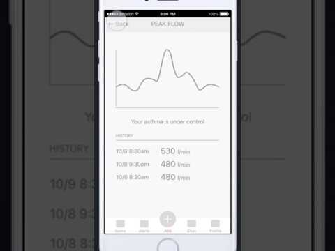
Incorporating the user research, usability testing, and UI elements, I finalized the direction and created high fidelity mockups.

Summary
This project was great to work on. One of the most challenging aspects of the process was conducting and analyzing the research and figuring out how to best serve the users. I really enjoyed creating the modern, clean yet rich UI experience.
