Tidal TurnUp
Concept | iOS App
TurnUp is a new feature for the Tidal app that connects users by letting them simultaneously play music through multiple phones. My role was to research, design and test all UIs related to this feature. This project was completed as part of a Designlab capstone project.

UX Strategy
After receiving the project details, I created a UX strategy blueprint to clarify the goals, success metrics and design criteria. This helped me not only narrow down my research focus, but also understand the larger scope of the project and how it was to fit into the existing Tidal app.

User Research
In order to better understand the users and how this product would best fit into their lives, I started my research by doing a thorough market survey and competitive analysis. I also conducted a survey which received 28 responses and performed three in person interviews with people within the target demographics. Talking to potential users showed me what features they find most important, how they use them and how they go about discovering new music. After completing the research, I created a persona to better understand and empathize with the users. My persona helped to personalize the data and insights that I received during my research. It was also helpful to have to refer back to when I encountered difficult design decisions later on in the project.

Application Map
By using the insights I gained during the research phase, I created an application map that shows how a user would move through the app feature. It was important to make the feature flow intuitively with the rest of the app so both new and existing users would easily convert.

Wireframes
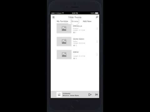
After understanding the different user flows a person would take through the feature, I created lo-fi wireframes using Sketch to clarify the information hierarchy and key elements. These also served as the basis of the lo-fi prototype that I created to test the information architecture and element placement. I prefer to start out hand sketching potential solutions for the layout of the application and then from there build the lo-fi wireframes in Sketch where I can further iterate upon them.

Usability Testing
Seeing is believing, and my userflows finally came together after I had potential users play with the product. I created a mid-fidelity prototype in InVision to test design decision with people from the target demographic. I was uncertain of the chat feature location but the results were overwhelmingly positive. You can check out the prototype below.

Hi-Fidelity Mockups
After completing the usability testing and making several iterations upon my designs, I created these hi-fidelity mockups to show what the final design would look like. It was very important that the feature feel cohesive within the rest of the applications. Therefore, in order to maintain visual consistency, I used the colors and style of the Tidal app within this mockup.


Summary
I learned about the process of creating an iOS app and about the design patterns that come along with that. During the user research process, I was surprised to see that all of the testers found that the chat button nestled inside the specific TurnUp felt intuitive for them. I was worried that it was going to be too hard to find. One of the most challenging parts of this project was developing a new feature while integrating into the existing application and making it work within a users' current listening habits. While the project was a great learning experience, I especially liked iterating upon my design wireframes and testing them with users. Getting feedback on my designs was great and I loved being able to create something that users' felt was easy and intuitive to use.
