Conscious Period
Website Redesign | Branding
Conscious Period is a new female period product company that focuses on organic ingredients, giving back to the community and sustainable practices. My role was to research, design and test a website redesign and also to clarify their brand voice across different platforms.

UX Strategy
After talking to the stakeholders about what they wanted in the new design, who their target audience was and what success metrics were most important to them, I started the UX Strategy Blueprint. This helped me further understand what to focus on during the project.

User Research
To better understand the users and what brand voice would resonate best with them, I started my research by doing a thorough market inventory and competitive analysis. I also conducted a survey which received 34 responses. I distilled my research by creating a persona. 'Luna' helped me empathize and better understand my end users.

Site Map
After creating my persona, I made a sitemap that allowed me to easily visualize the information architecture of the website. The process also clarified what pages I was going to need to design.

User Flow
Here is the main task flow that a user would take through the website, from googling the product to their order confirmation. By creating the user flow it helped me to understand exactly where the decision points are within the customer's decision process. It gave me the user's perspective on the site's organization allowing me to see which steps could be improved or redesigned.

Sketches
They might not be the prettiest design artifact, but sketching through my ideas is essential to my design process. I always start by sketching my wireframes so that I can easily test out ideas without being attached to any idea to early.

Responsive Wireframes
When I started the wireframes, I wanted to make sure that what the product was and that what made it different from others on the market was the first thing the user saw when they landed on the site. I also wanted to incorporate testimonials, product reviews and brand articles to strengthen the value of the product in the users mind. Also, I wanted the top navigation to be more clear by combining the about and giving pages and also adding a CTA. My goal was to make the user flow, from finding the site to purchasing the product, as frictionless as possible.


Style Tile
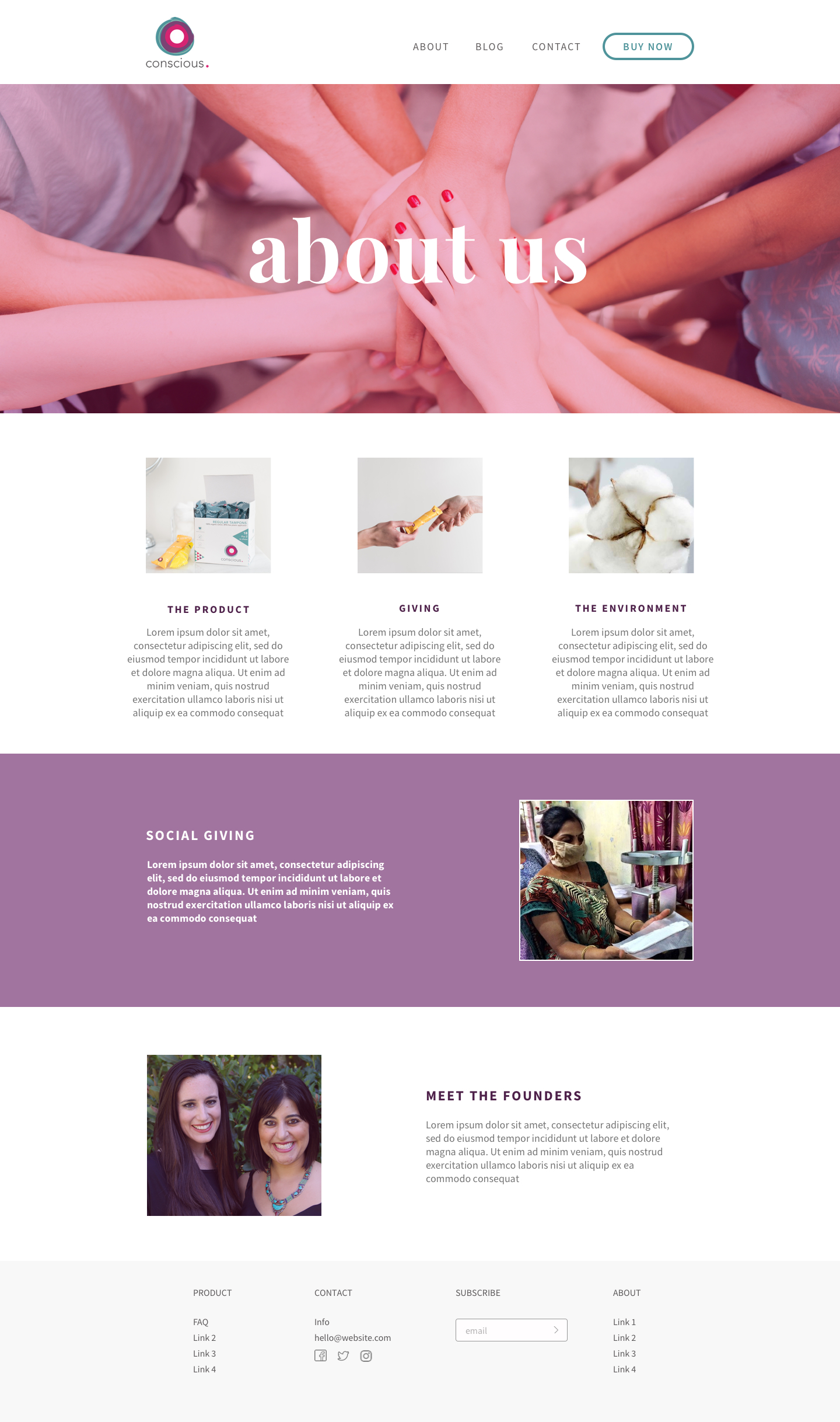
After completing the wireframes, I started gathering inspiration for the look and feel of the site. The brand logo was already designed and used in packaging so that needed to stay the same. Since the brand needed a cohesive look I used the colors from the logo and created a look that was strong, feminine and fun.

Hi-Fidelity Mockups
I created these hi-fidelity mockups by incorporating the usability testing that I ran on the wireframes and the stylist choices that I had decided upon. I also ran usability testing on the hi-fidelity mockups testing the 'trust' associated with the brand. Overall, the trust factor was rated very positive.


Summary
I really enjoyed working on this project and it is still in the development stage. One of the most challenging issues that I encountered was how to make this type of product seem fun and get someone excited about buying it. From my research, I found that people really wanted a subscription service model which is something I pushed for in the designs because I believe it will really help from a business perspective.
